To build this website, I used the software Kompozer to type the code. All images on this website are original except for the image of the wave on the index page and any company/website logo images.
| Source | Use | Where Used |
|---|---|---|
| LogoMakr | I used LogoMakr to create the main logo for this website and to create the favicon. | On every single page |
| Pixabay | I obtained an image of a wave from Pixabay. | On the index/home page |
| Freepik | The blue watercolor background vector is from Freepik | On every page |
| References | Use |
|---|---|
| W3Schools | I referenced w3schools a lot to learn about various aspects of web design such as syntax, css properties, how to code hero images, accordions, image carousels, overlay, parallax, and thumbnail images. |
I chose to use hero images at the beginning of each page because I thought they added visual appeal as well as value to the website by making the content of each page clear. For the home page, the hero image I used was of a large, thunderous wave. I thought this image represented the theme of "power" pretty well, which is why I used it. For the subsequent pages, I used hero images that were relevant to the content of each page.
To maintain a clean look, I decided to use a simple color scheme of white, shades of blue near the color #28d8ff, and black with #3333FF (dark blue) and #FC2DA9 (pink) accents. I originally had blue outset borders around the footer and content sections. However, upon further inspection I decided that this made the website look dated and clunky, so instead I opted for solid borders.
I wanted a background image that would look good and blend well with the hero images and the color scheme of the website. After a long search on Vecteezy and Freepik, I finally found the perfect background. It is a subtle, visually pleasing blue watercolor vector.
Initially, I applied the background image to the entire webpage, including the header section. I quickly realized that the header did not look good with the background image. So, I decided that I would still use the background image, but I would only apply it to the section of the website after the navigation bar and hero image. To do so, I created a new div container with the background image. I started the div container right after the hero image, and ended it after the footer. This created a cleaner look. I also decided to try a parallax scrolling effect to see if it would look good. I liked how parallax affected the scrolling, almost like the header and hero images were lifting off to make way for the main content of the website.
The sidebar on the Fundraising page discusses various aspects of the 2017 hurricane season. Since there was so much information that I wanted to include, I chose to use an accordion. This made it easier to organize all of the information, and it also makes it easier and clearer for the user.
I learnt so much over the years competing in the MCWT Web Design Competition. I first started when I was in the 9th grade. I had absolutely no clue about anything relating to web design. I gained a lot of web design knowledge participating in this competition, moving up from the Beginner to the Advanced category.
I am really grateful to the MCWT for having this competition every year. Because of this competition, I have discovered something that I am really passionate about. The skills I have acquired competing in this competition over the years will definitely help me in the future in college and in whatever career I pursue. Thank you MCWT!
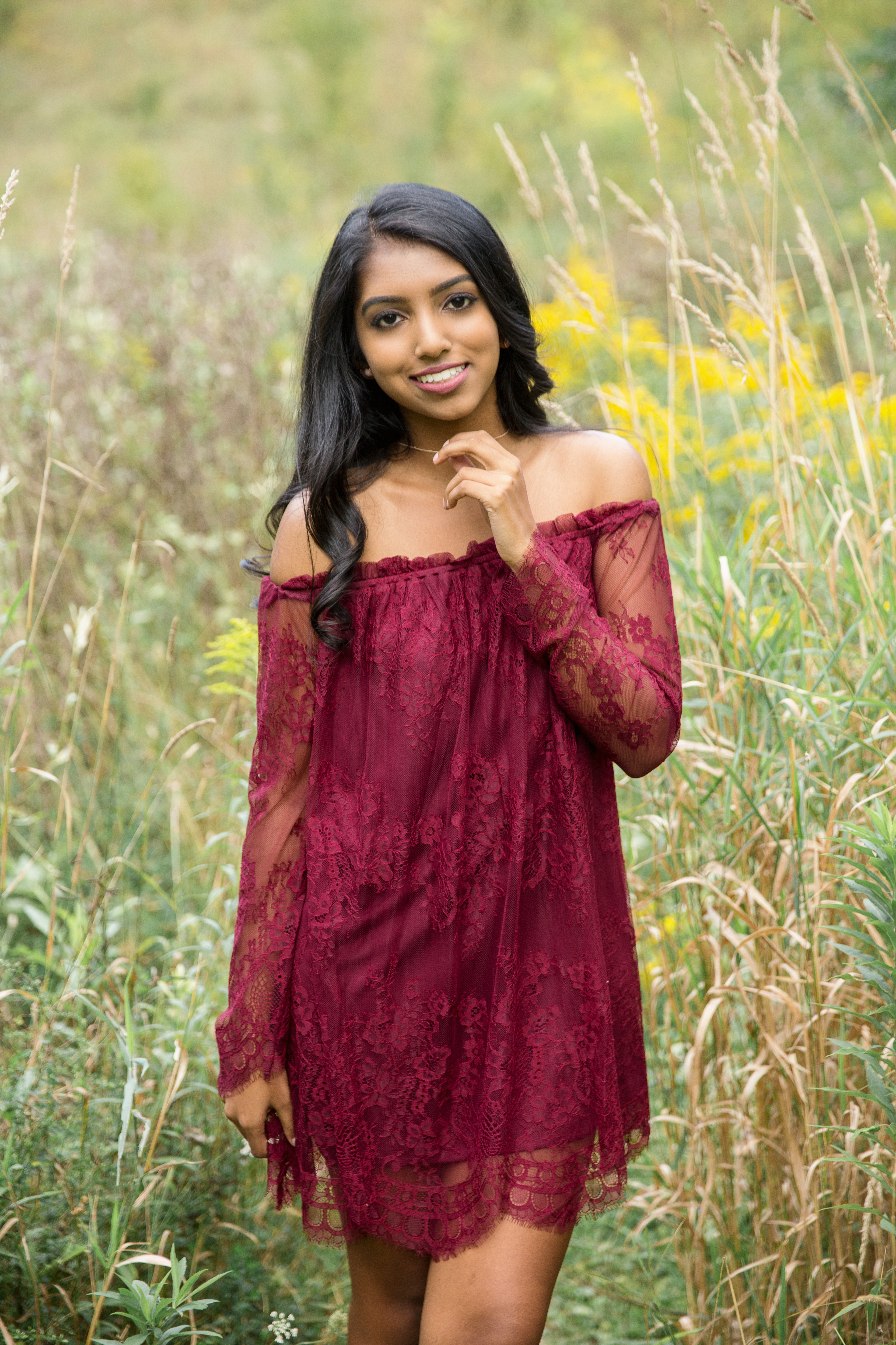
Name: Manisha Solipuram
Grade: 12th
School: Walled Lake Central High School
Web Design
Experience:
I have been coding websites for 3 years so far. I am mostly
self-taught. However, this year in school I am taking a web design
class (Web Design 1A/1B). So far we have covered XHTML basics, though
we are just
starting to learn how to use DreamWeaver, which I am not using for this
website.
